.png)
Hop In is a EU co-funded Finnish startup launched in 2024 that connects users with sports clubs and other recreational activities near them. Their main product is their consumer facing app where users can find and sign up for activities they're interested in. They also have a service provider facing app where clubs and organisers can manage their listings.
Prior to launch, they wanted to build a company website to showcase their platform to potential investors and users and commissioned me to build it. I was the sole web designer on the project and built the site from start to finish using Webflow. I worked in close collaboration with the company founder throughout the project. I also worked indirectly with a branding agency and the software company developing the applications to ensure branding and content alignment.
See the link below to visit the website.
Go to Hop In website
The company was at a pre-launch stage at the start of this project and the mobile applications were under development by the software company Sarkain. The focus of this project was to showcase the company to potential investors, partners, and customers before and around product launch.
The main goals for the website were to:
I chose Webflow as the development platform because of its convenience, high quality, and high control over the design. This was my first project using Webflow, so I largely built the website by experimenting and learning on the platform without using a design tool.
I took inspiration from other high-quality startup company websites for the structure and visual layout of the site. I also used an early company sales deck to provide general guidelines for visual style.
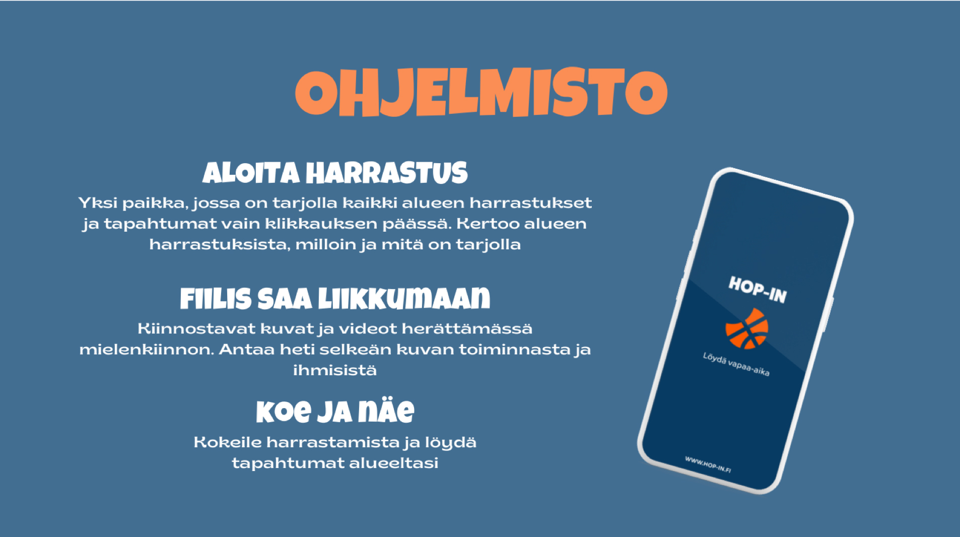
I created device mockups and images to showcase the app features using snapshots from the prototype.
.png)
I added background images to make the pages more visually appealing. I overlaid a brand colour tint on the images for consistency and to ensure text legibility.
.png)
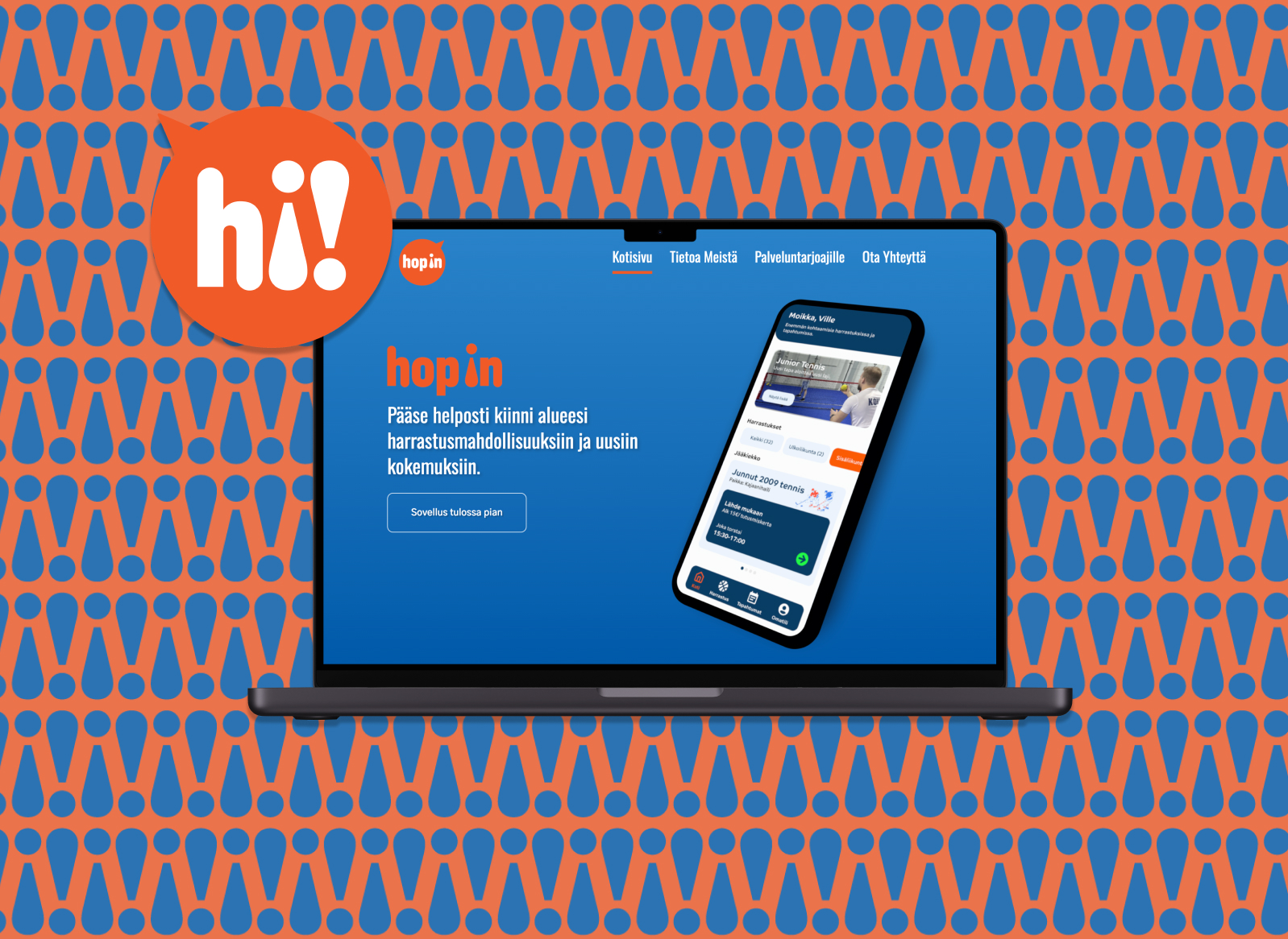
After the preliminary website was launched, a branding agency provided a revised brand identity with a new logo and graphics. I went back to update the visual design of the site to align with this new identity.
The main changes were that the orange and blue colour palette was made slightly more saturated and bright and the logo was changed to the speech bubble logo of the current design. I also incorporated the font they used and the graphics they had provided as a section background (see blue and orange exclamation mark graphic in the hero image of this page).
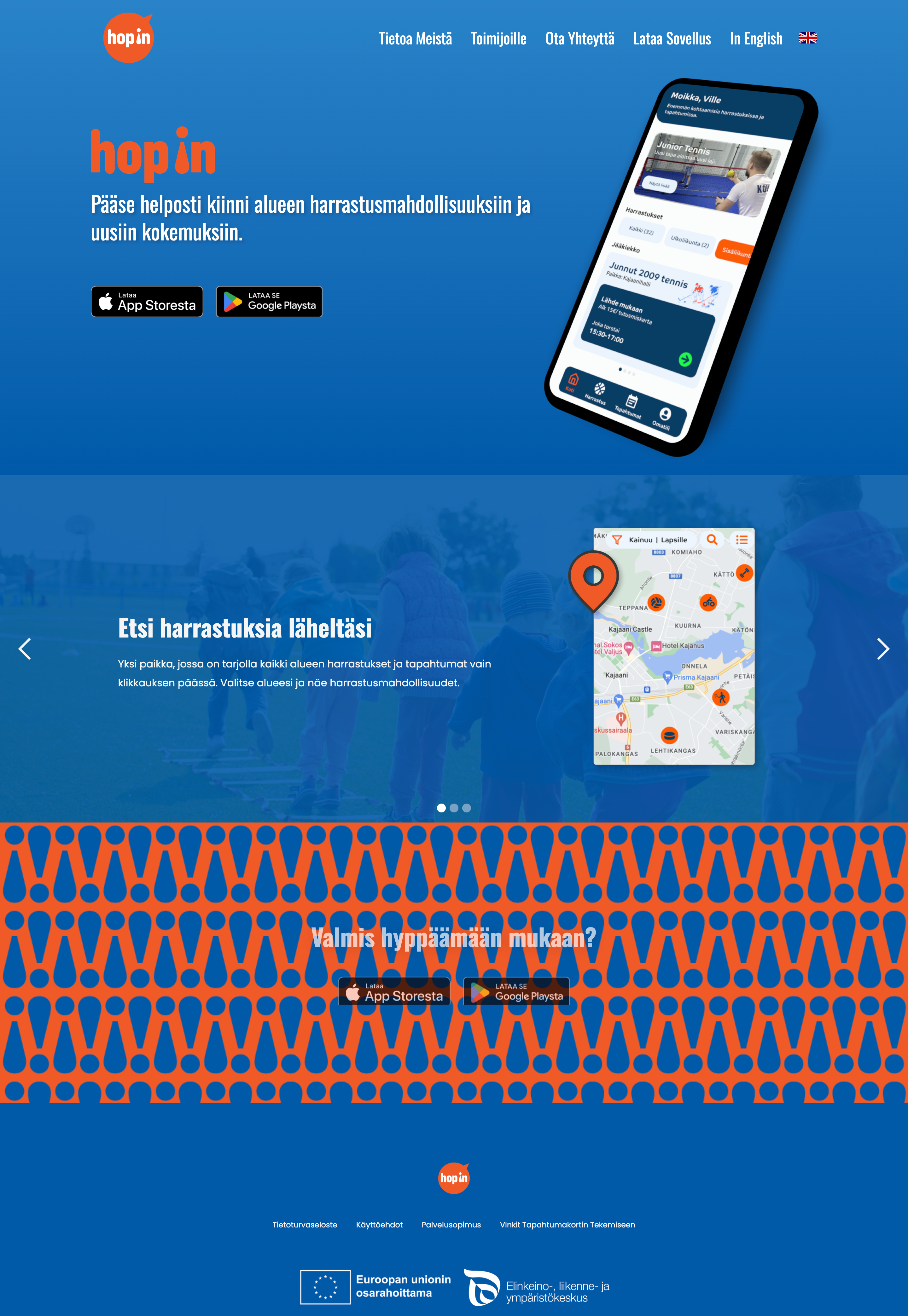
I also made other visual improvements, like changing the front page feature section that showcases the app from a stacked vertical section into a horizontal carousel scroll.
The below screens illustrate the finalised designs of the homepage and About Us page. You can see the full website from the below link.
Go to Hop In website
.png)
This website was created to showcase Hop In to potential investors, partners, and customers. I set up Google Analytics tracking to monitor engagement, and the site received up to 220 active daily users shortly after its launch. The project concluded with final additions to the page taking place in September 2024.
Since then, the website has been renewed by the company developing the app to enable better integration with the app's booking functionality. For future iterations, approaching the technical aspects of the site - particularly loading speeds - could have been valuable. Although testing the site using Chrome DevTools to simulate low-bandwidth conditions raised no notable issues, further optimisations, such as compressing large images, could have improved performance further.