.png)
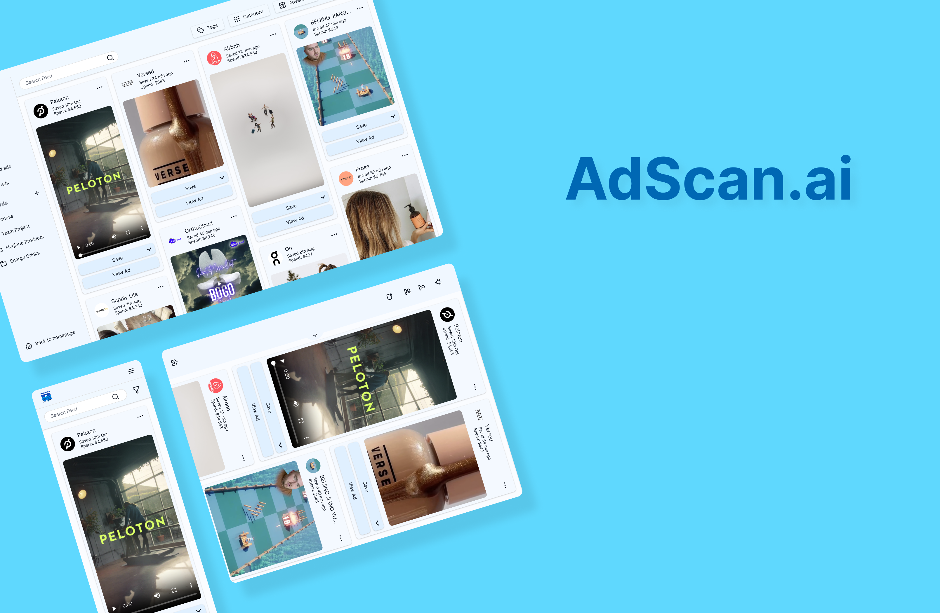
AdScan is a one-stop-shop for digital marketers to find inspiration for their digital advertising creatives. It allows users to easily browse, share, and find performance data on online ads from across the the most popular digital marketing platforms like Meta, Instagram, TikTok, Google, and more.
This project was undertaken after the launch of a minimum viable product (MVP). The scope was the complete redesign of the platform for the beta version.
I worked on the project as the product designer with the development team.
The main business objective was to improve user retention and encourage users to get a paid subscription.
The design focus was to create a visually appealing user interface and improve usability by providing a fluid browsing and navigation experience.
I carried out a competitive analysis and reviewed feedback from early users of the MVP to determine what were the most important features and user needs to focus on. These were summarised in three main tasks:
One of the limitations of the MVP was the lack of formal site structure. The pages were not ordered in a hierarchy, and the result was an unintuitive and difficult navigation experience.
I created a sitemap to organise the site for the new version.
.png)
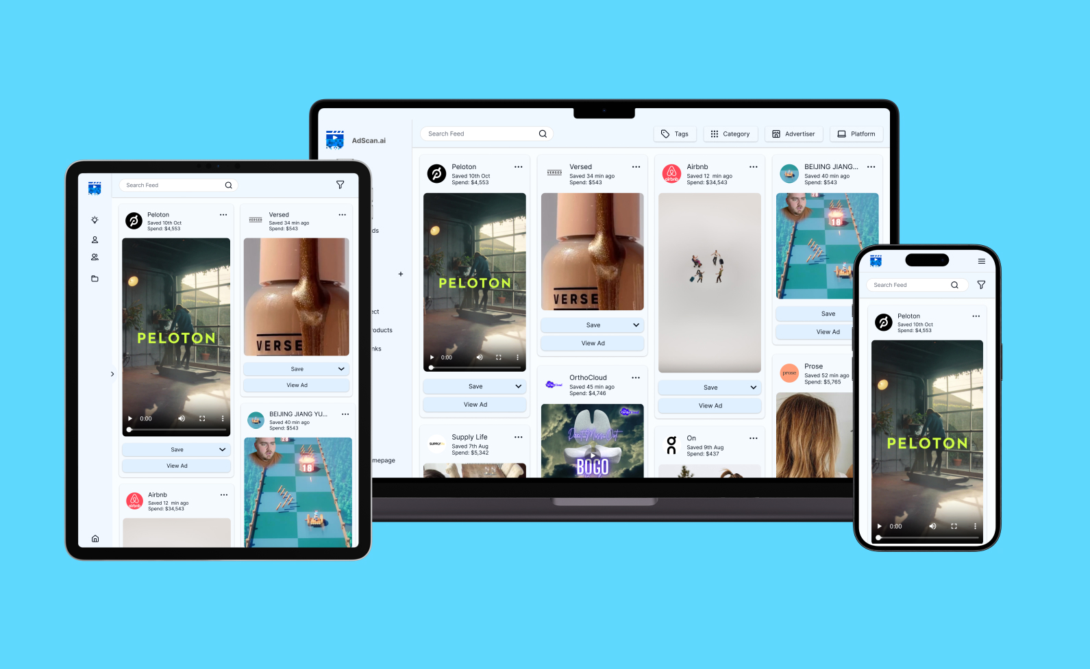
This project focused on the dashboard section, which hosts all the functional aspects of the platform.
I created a user flow diagram and wireframes to outline the pathways users might take in completing a task. The four user tasks that were focused on were:
It was assumed these tasks would be done in tandem, so specific consideration was given to how users might move between them as they navigate the platform. The below analysis ensured that there were sufficient navigation points between pages to make moving between them as fluid as possible.
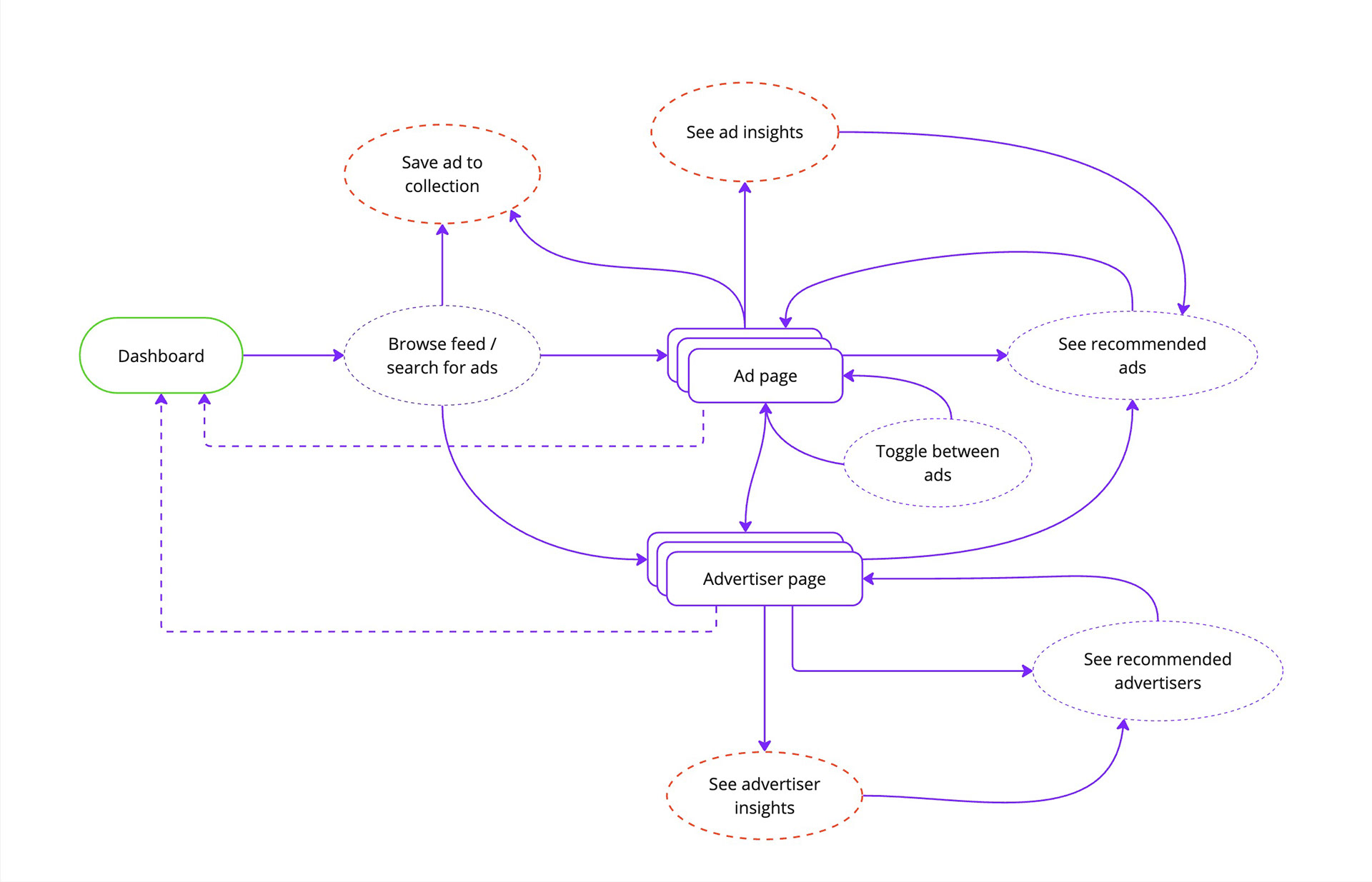
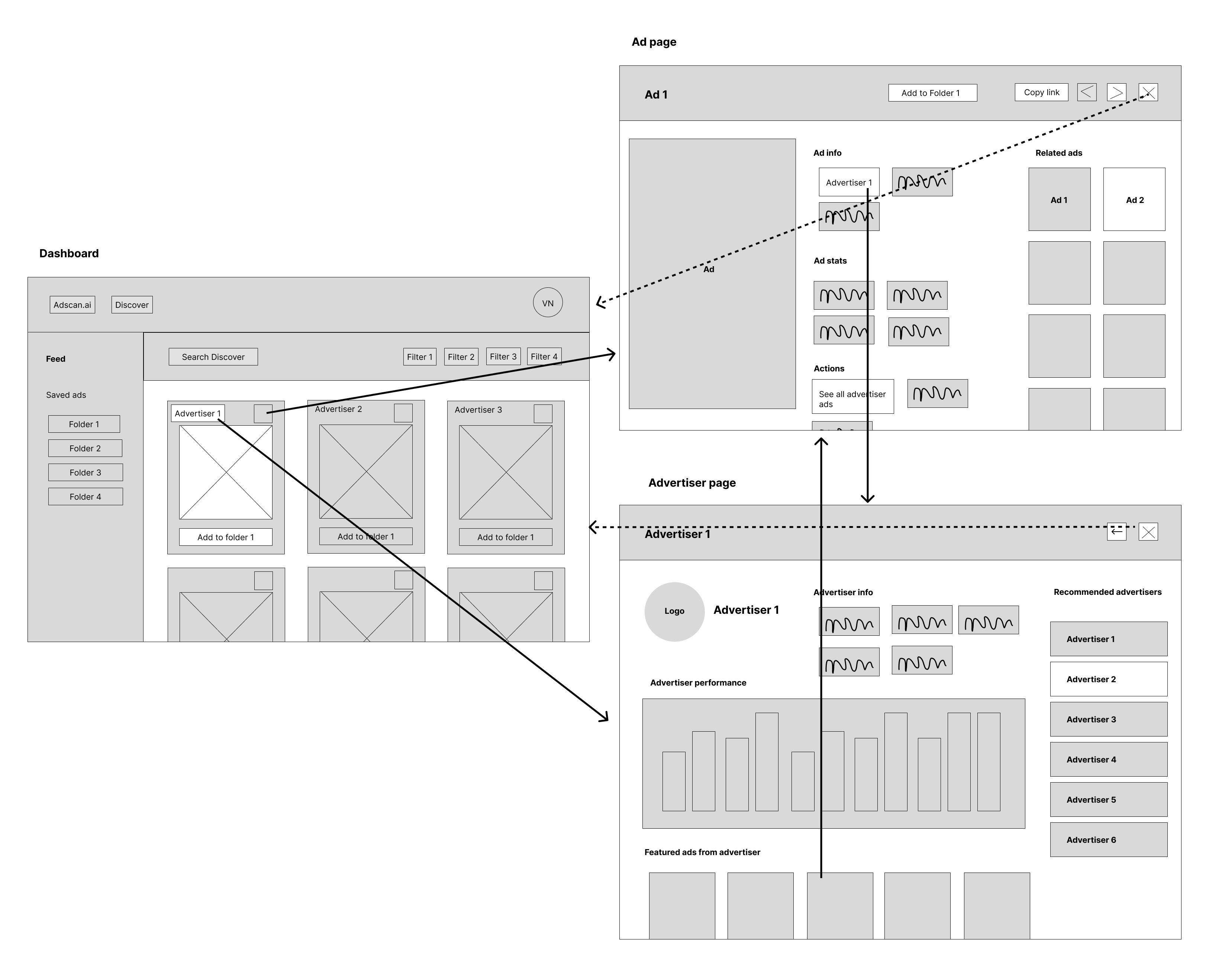
This one-click design allowed users to move between any of the pages with a single click. The dashboard would serve as the central point for all navigation.
The prominent navigation points between ad pages and advertiser pages specifically encourages users to explore the platform further by making it easy to browse related ads and recommended advertisers.
The designs were presented to the development team at various stages of iteration to ensure they were technologically feasible.
Among the things that was deemed too difficult to implement was having both side and top navigation on the dashboard. Consequently, after the all navigation was moved to the side bar in the final iteration.

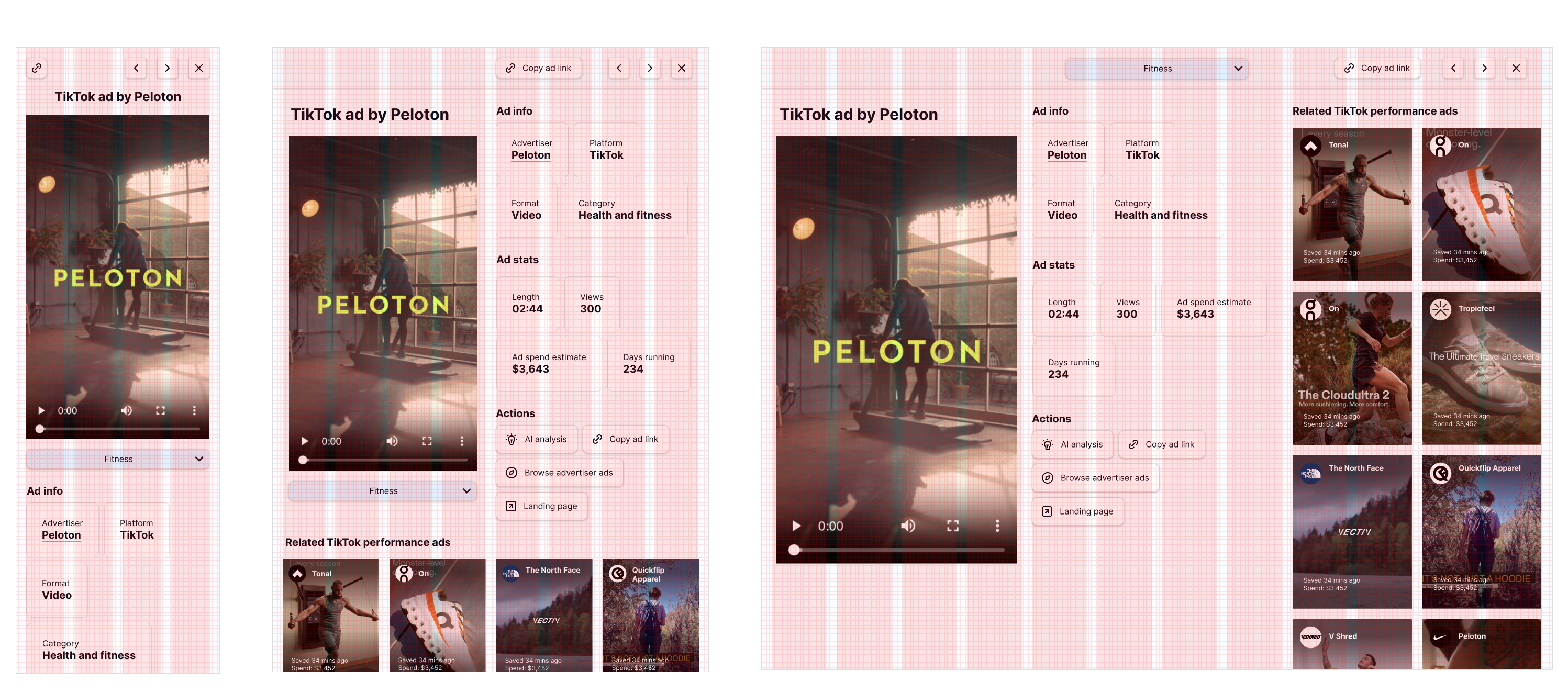
The platform is mostly desktop focused, but the designs were produced with a mobile-first approach to ensure a consistent and optimised responsive experience.
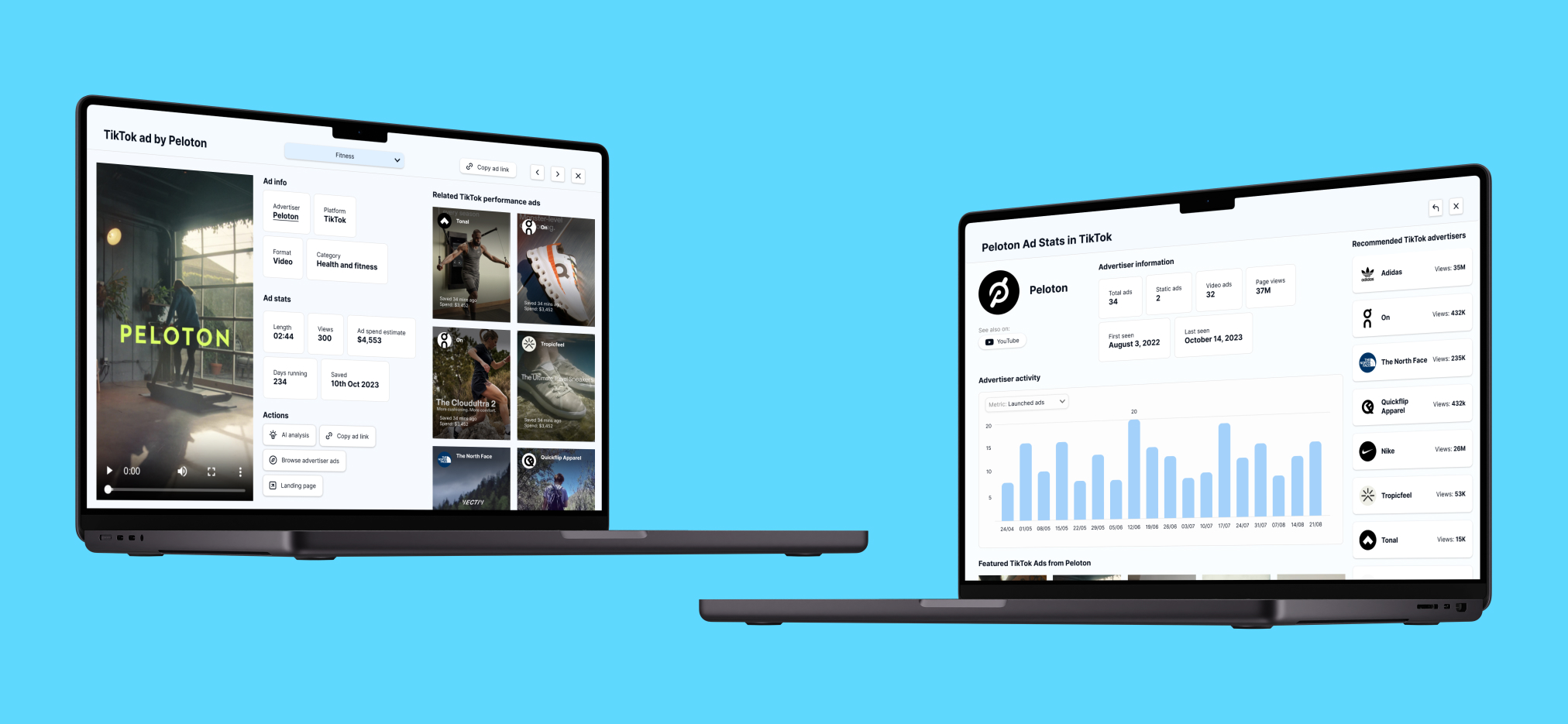
This was particularly important for the ad page because it was hypothesised that a common entry point to AdScan would be shared links to ad pages on mobile devices.
The new user interface used the MVP as a foundation, but there was a major visual redesign across the platform. I completely rebuilt the layout on Figma and refined everything from spacing, UI elements, icons, typography, to colours and more.
A notable change was overlaying the ad page and advertiser pages on top of the dashboard instead of taking the user to a new page. This was done to reinforce the sense of seamless browsing and having the dashboard as the anchor point for all navigation.

AdScan hosts both vertical and horizontal ad creatives, which presented a considerable challenge for designing the visual interface. The main problem was that designing pages for horizontal videos would inevitable make vertical videos look awkward, especially on tablets and desktops, and vice versa.
It was hypothesised that the majority of the ad creatives would be vertical since only one of the advertising platforms, YouTube, used the horizontal format extensively. I therefore opted for a mostly format-agnostic crop where possible, such as on the “Related ads” section. These rectangular crops are slightly vertical to optimise for the more popular vertical ads but not to the exclusion of horizontal ads.
The ad page was an exception where there was no visual design compromise which would have served both ad formats. The solution was to design different layouts to accommodate for this difference while maintaining as much consistency between them as possible.

The below screens illustrate the finalised designs. You can also access a clickable Figma prototype of the desktop version via the below link.Clickable prototype
The designs are currently awaiting implementation from the development team. The scope of the project was a complete redesign of the platform delivered in four months with limited resources, so there are many aspect of the platform that require further design effort.
For example, analysing the user flow between pages would in itself be an interesting design project that will hopefully be carried out at a later time.
This project did not have the resource for extensive user testing, so a particular point of interest after launch would be measuring how long users spend on the platform with the new design compared to the MVP. Furthermore, it would be interesting to investigate how this impacted the rate of people who subscribe to the paid membership.
Similarly, it would also be interesting to measure which page users spend most time on and find most valuable. This could inform be the primary focus of future development. Analysing the user pathways through different pages and how many of pages users go through in a single session, for example, would also inform how the user flow can be further improved.
Furthermore, feedback on whether users will find the vertical and horizontal ad page designs intuitive would validate this design decision.